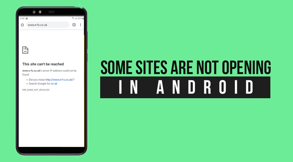
Many website owners face a situation where no matter what they do. They keep complaining that some sites are not opening in android. Now that is pretty concerning because this negatively affects the mobile rankings of a website.
The reason behind such a problem can be numerous. Depending on the problem, you can solve it by following some simple techniques.
To help you out with such a scenario, we have come up with a guide that will provide you with different ways to make your website mobile-friendly. So, let’s take a look into it quickly.
Why Some Sites are not Opening in Android?
In order to get its fixes, it is important to know the reasons that are retaining your website from being mobile-friendly.
Many people claim that they face a situation where the responsive web design is working on desktop but not on a mobile device.
As mentioned earlier, the cause can be numerous. Let’s take a look into each of them one by one.
- Bogus Content
- Popups or interstitials
- Sluggish mobile pages
- Unoptimized mobile-first indexing
- Mobile unresponsive website
- Unoptimized CTA for mobile devices
For better results, it is always better to consult professionals. Thus, select the best SEO Agency Dubai for a top-class outcome.
What to do If Some Sites are not Opening in Android?
Now that you are clear with the reasons that are resulting in such a situation, we are going to mention the fixes for it individually. Here is how will be able to make your website mobile responsive
1. Make Your Content Prominent
It is rather obvious that the content we see on a desktop and the content we see on a mobile device is different from each other. The elements that look attractive on the desktop version can be annoying. That’s because these elements can move the important part to a lower level.
Thus, to get rid of such a situation you can try shifting the important part of the content to the introductory part. Besides, decreasing the loading time, headers, nav menu can also help. Configure the tittle sizes and ignore pop-ups so that the content can be visible more prominently.
Lastly, features like lazy loading can help your user to load text before other entities (image and videos) so that they could read it without any issue.
2. Add Popups that are Mobile Friendly
Although it is better to ignore popups on your websites there are various ways by which you could actually avoid their adverse effect on it. Here are some of them listed below for you
- Involve Exit-intent popups that appear when the user is about the quit the page
- Try avoiding popups that take your entire screen space
- Add notifications, CTA, chatbots or chat widget
- Do not complicate the popup icon closing process
3. Sluggish Response from Mobile Pages
The loading time of a particular page is extremely important and if it falls down, the site would not open on android devices. Make sure that the page loads within 3-seconds. However, if it does not, you can try some of the tips listed below
- Avoid using diverse web fonts and plugins
- Shorten the image and limit the server requests
- Implement clean code and the current code version
- Decrease JavaScript and core files
- Make use of CDN and try caching
- Ignore redirects and compress the images
4. Website that does not Response on Mobile
The web design that is mobile responsive and can resize the website to various screen sizes is called responsive web design Google. Many websites lack this factor and hence they do no open on your mobile device.
It is important to keep note that when you design a website, you are doing it for all. This means that the site will be opened on different devices as well. Thus, the entire task should be executed accordingly.
To make a website mobile responsive you can follow various factors. Here we have listed some for you below
- The content should be the same with clear size, contrast, and other features
- Ignore horizontal scrolling
- Everything should be touch configured
- The page should for all device
5. Not Optimised for Mobile-First Indexing
As we all know Google keeps changing its algorithm. Currently, their way of indexing is mobile-first indexing.
The terms mean that the pages will be indexed as the mobile version. However, if the mobile version is not available, the desktop page will show (only valid if you running both desktop and mobile pages individually in different areas).
Thus, it is pretty obvious that a website needs to be optimized for mobile-first indexing. Here are certain parameters you need to know before doing so.
- The content and structure of data for both mobile and desktop version of the page should be the same.
- Both should be verified in Search Console and must contain required metadata
- The robot.txt directive should be the same for both versions
- rel=canonical and rel=alternate should be used correctly on both the versions as well.
6. Design CTA Precisely for Mobile
CTAs that do not result on mobile can be problematic for a website. Call to action varies as per the placement and optimization. Their response can be different for both desktop and mobile versions of a website respectively.
Thus, it needs a proper design for mobile devices. Here we have some of the factors that will help you create mobile-friendly CTA
- CTA should be full-with and high in contrast
- Large buttons should be used to make it clickable on mobile screens
- The CTA text and headline should be short
- CTA height should be equal to the mobile screen display
Besides, the CTA on the desktop version is different than the mobile version. That’s because when you see it on mobile, it goes further down. Thus, try to place it during the earlier section of the post so that it could be visible to the customers.
How a Mobile-Friendly Website will affect your Traffic?
A mobile-friendly website will influence its traffic in a positive manner. That’s because, as per the recent observation it was seen that 53% of website traffic comes from mobile users.
Also, the mobile-friendly websites are considered favorable by Google and hence are subjected to rewards.
However, if the experience of mobile surfing goes down, you may lose around 53% of user traffic. That’s because people highly discourage websites that are problematic.